Shop
-
Book > ZEEN
Scheltens & Abbenes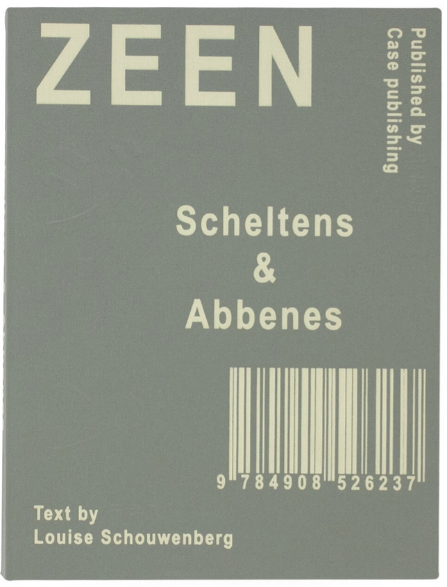
 konomad jounral の参加アーティストの一組、Scheltens & Abbenes の作品集のご紹介です。
ZEEN by Scheltens & Abbenes
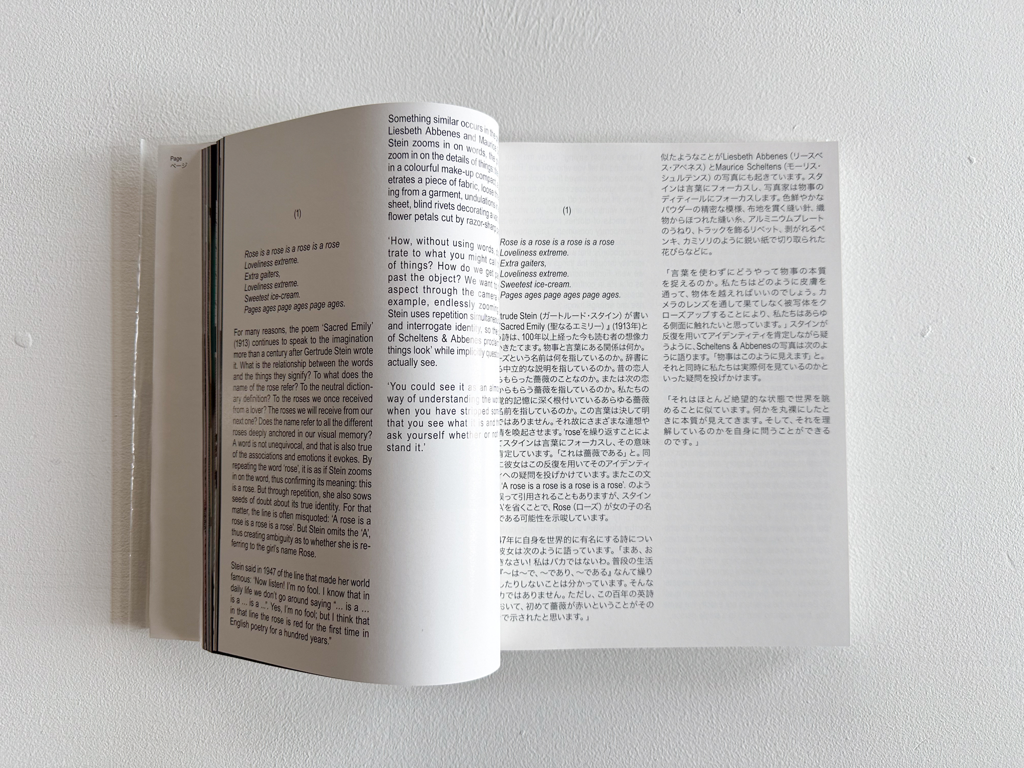
オランダ出身のアーティストユニット、Maurice Scheltens(モーリス・シェルテンズ)とLiesbeth Abbenes(リースベス・アベネス)の最新刊となる作品集である本書は、2019年3月よりアムステルダムのFoam写真美術館にて開催された同名の展覧会に併せて刊行された。
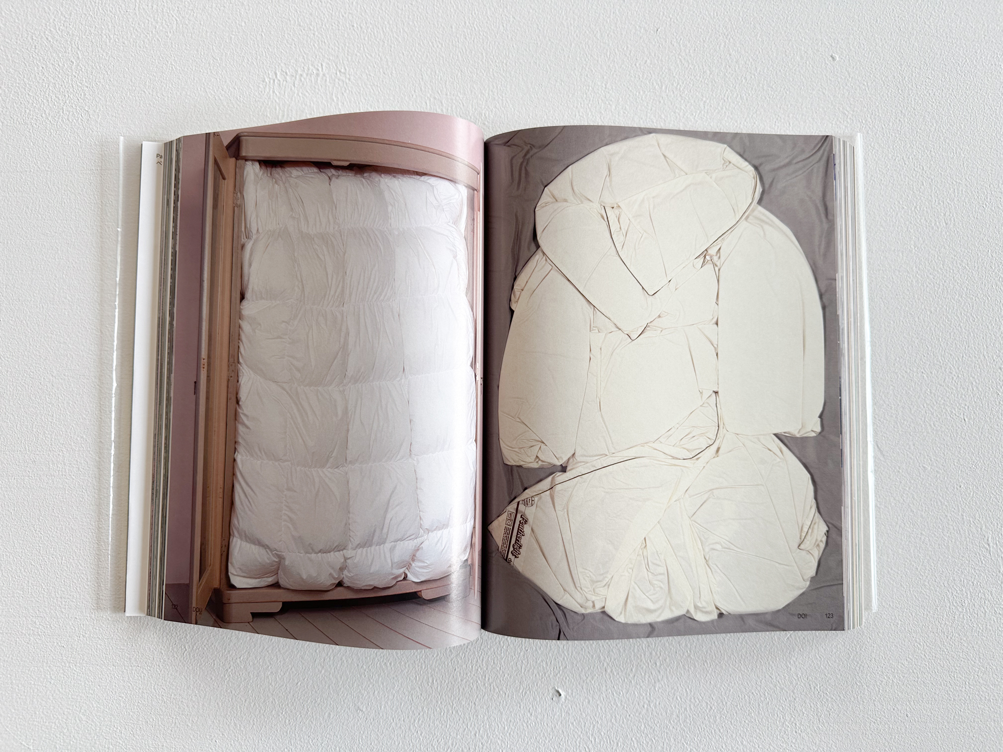
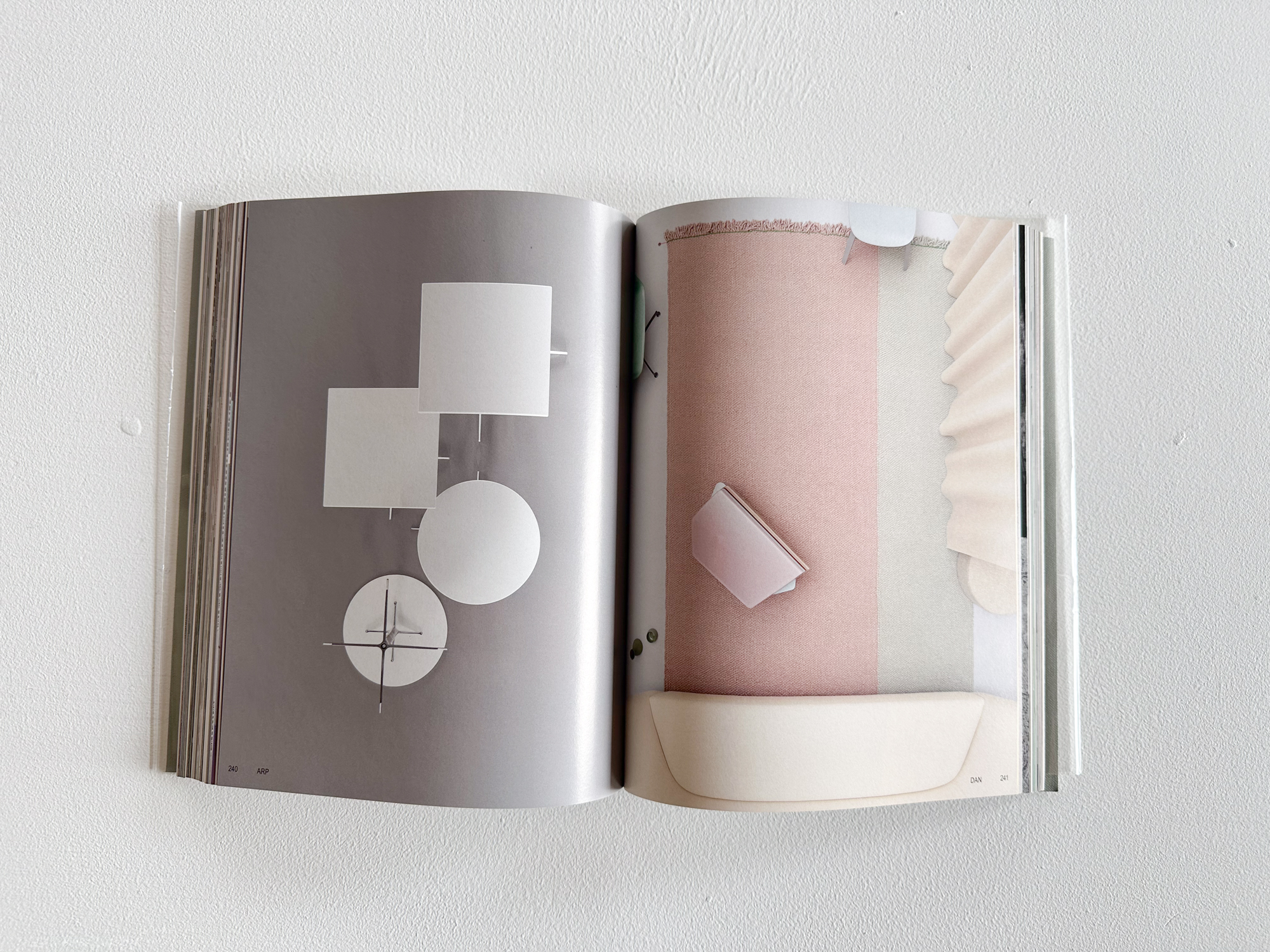
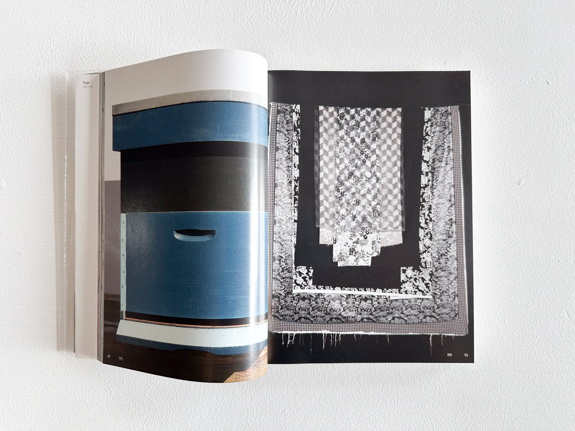
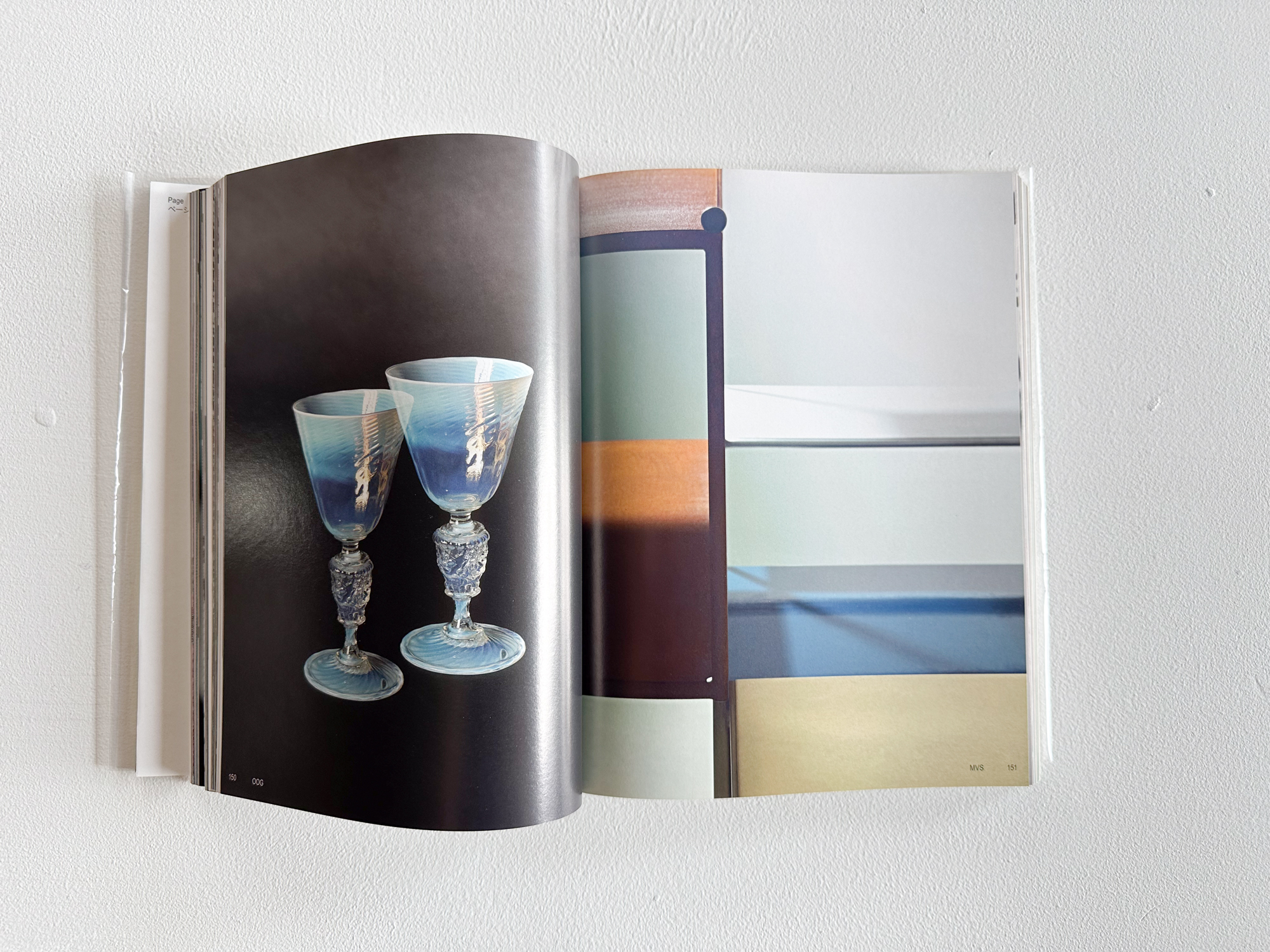
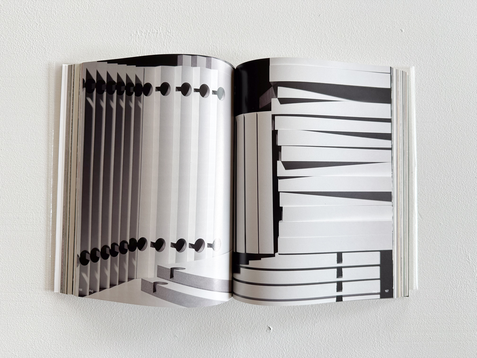
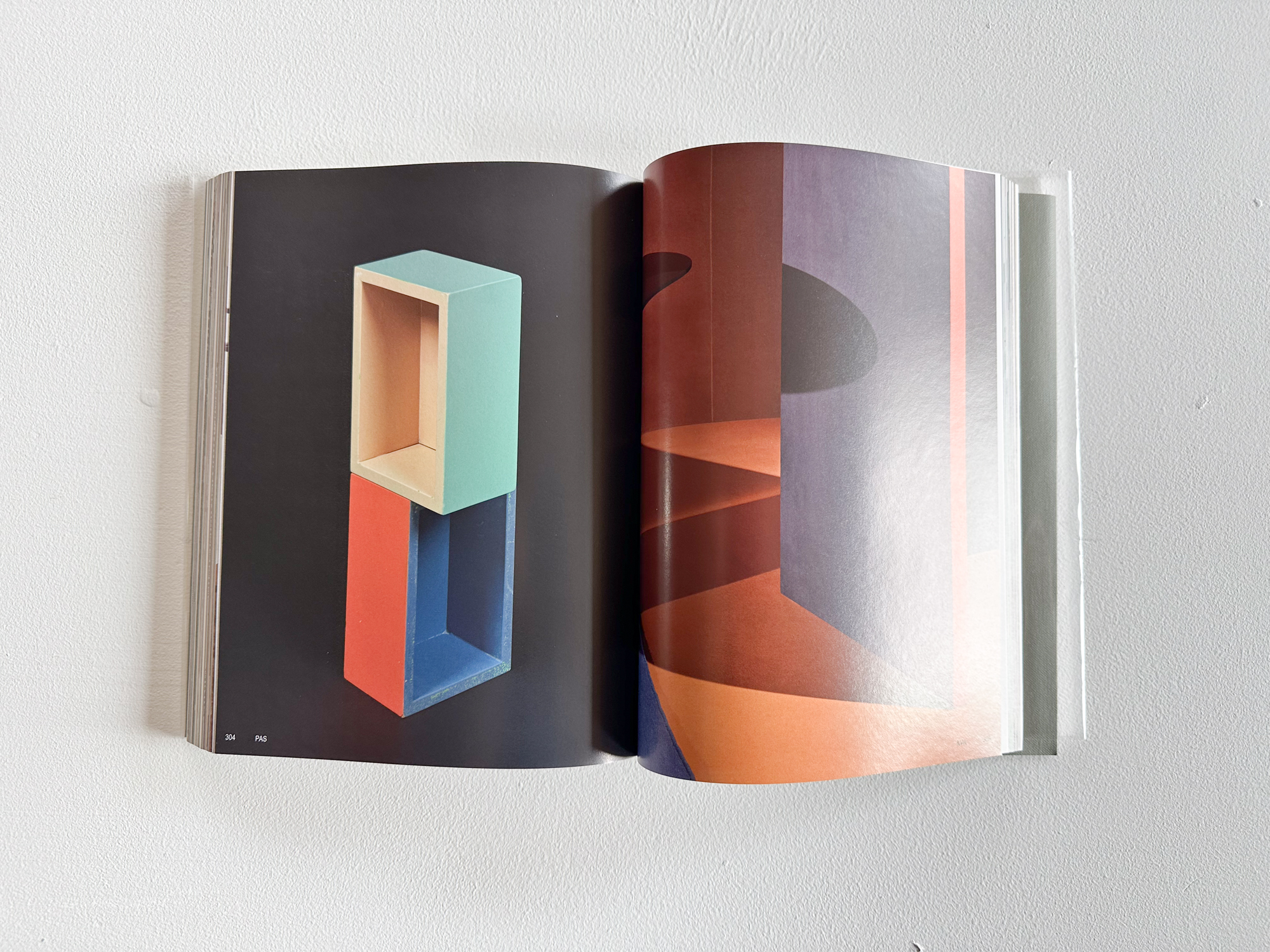
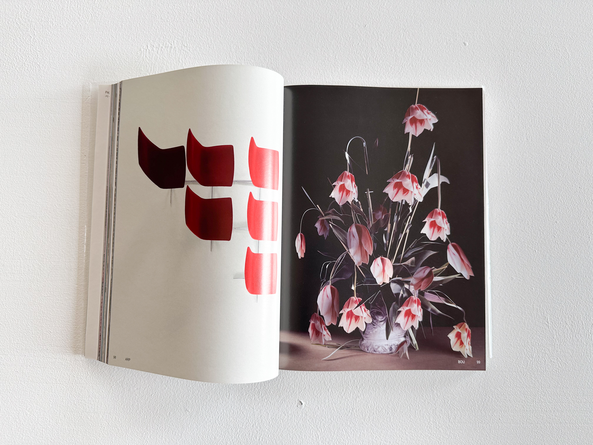
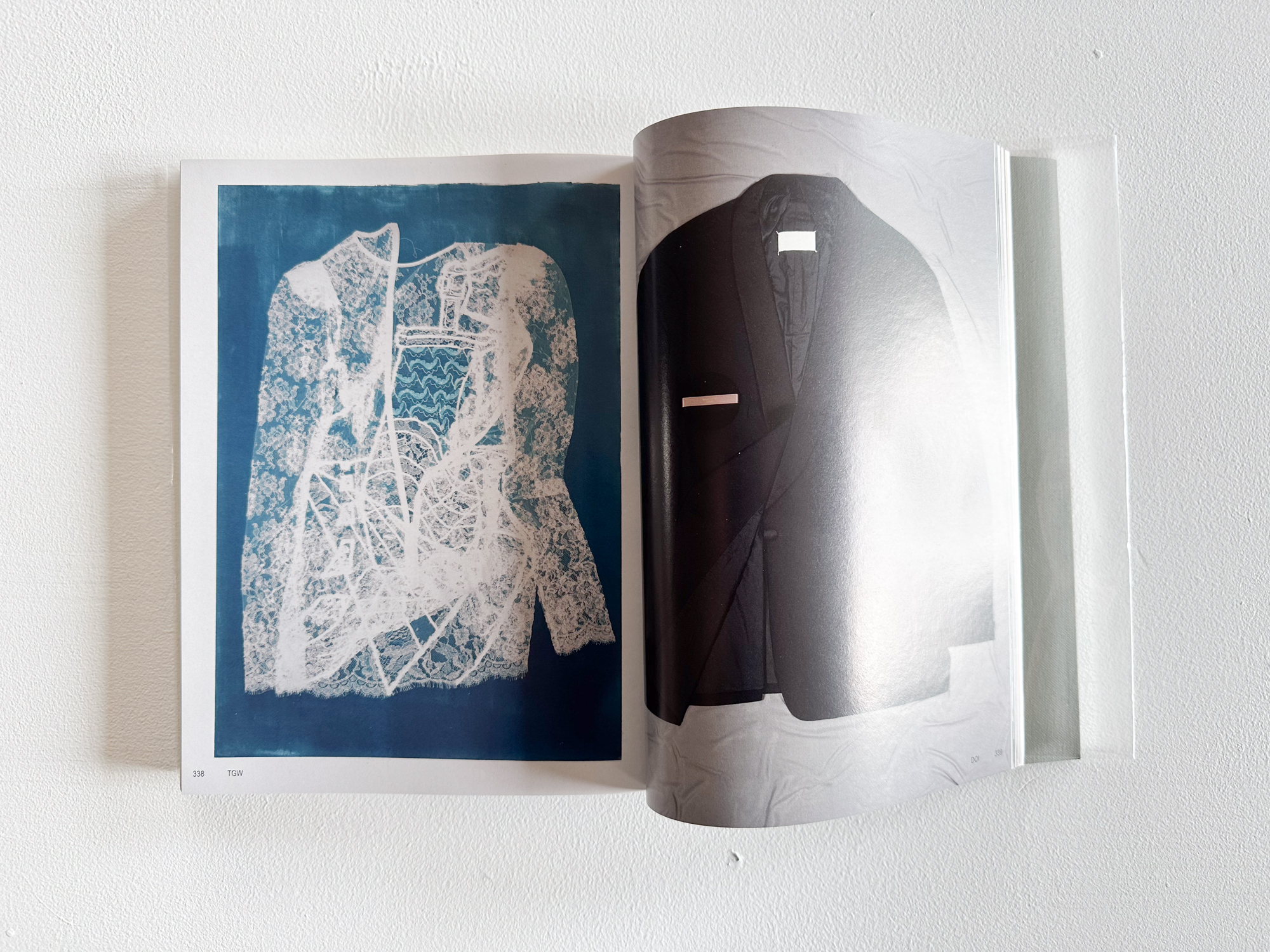
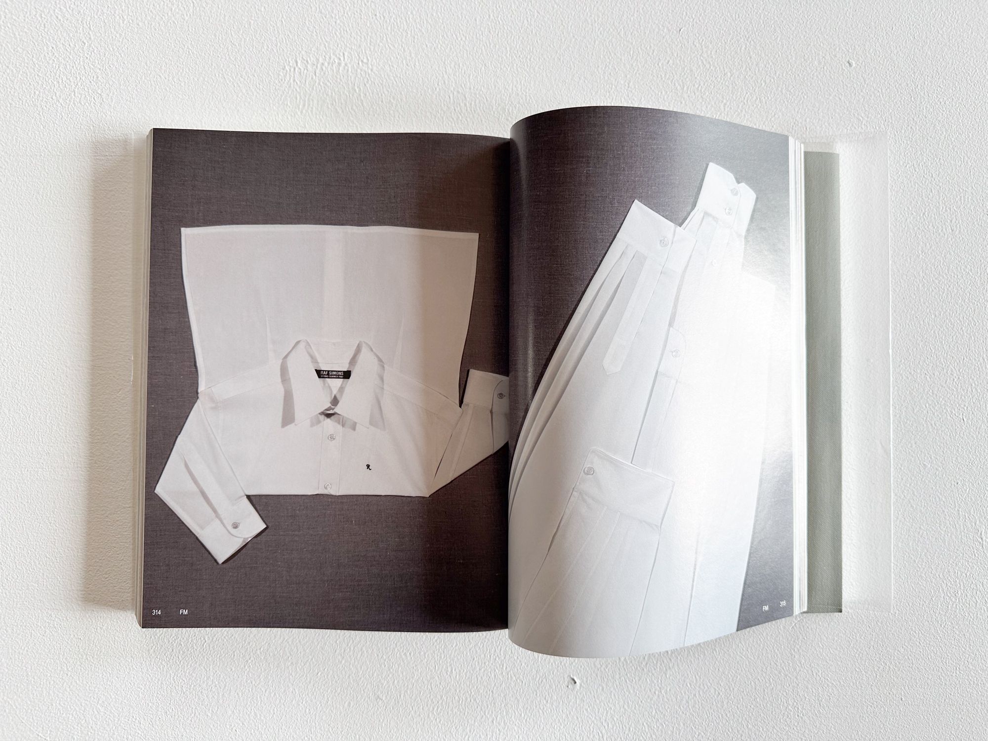
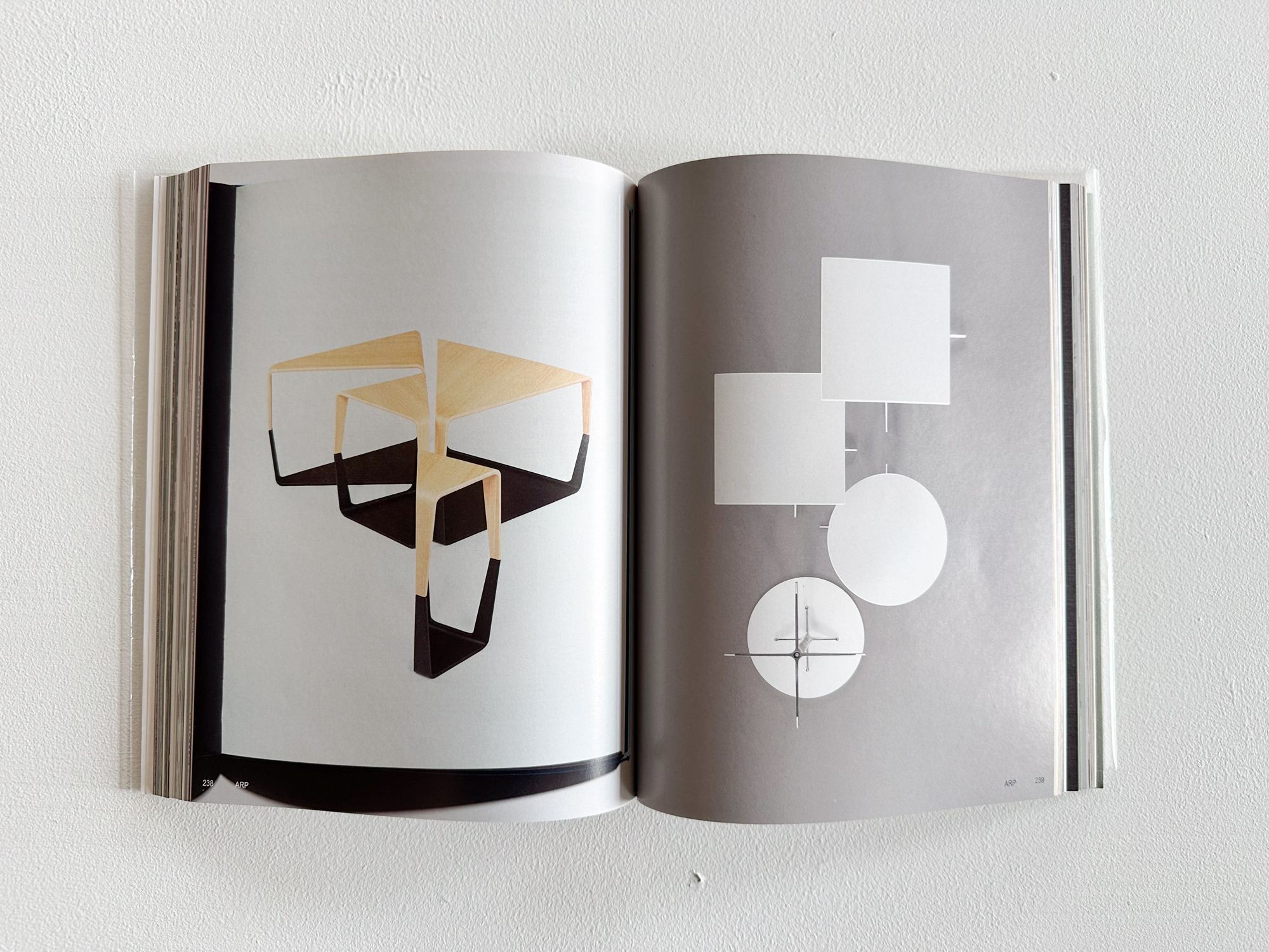
これまンズ&アベネスはエディを数多く手掛けてきた。彼らの作品は一貫した審美性を備えており、個々の作品がたとえ別個のシリーズ同士であっても、制作年や文脈に関わらず、互いに融合しうる可能性を携えている。その点に着目した本書には、各作品が最初に発表された出版物を複製して収録する。それぞれのイメージがいかに相互に影響を及ぼし合い、どのように作用するのか?様々な文脈を解明し、それらが観察や解釈の形成にどのように役立つのかを読者に気付かせる。なかには二回登場するイメージもあり、それは他のイメージと並べることで別の側面が新たに浮かび上がってくる。これらのプロセスを通して、シェルテンズ&アベネスは一貫した方法で、作品に隠された視覚的なレイヤーにフォーカスを充て、個々の作品とそれらの周りに存在するものとの関係性を明らかにしていく。
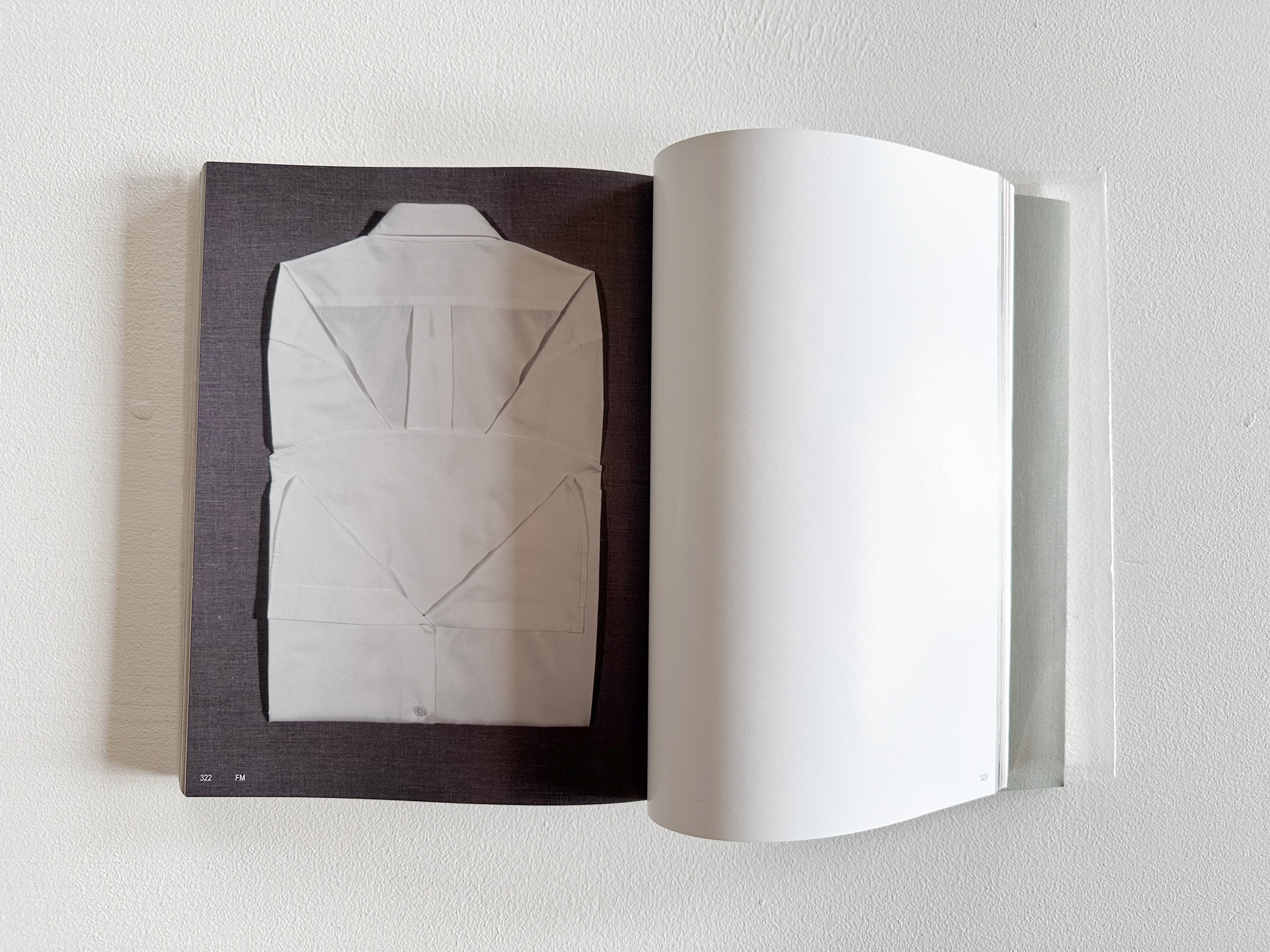
本書は独立した一つの写真集として十分に完結しているが、展覧会の来場者や本書の読者が、身の周りに存在するものに対して慎重に、時にはミクロのレベルで細部までそれらを観察するようにと促す。Esther de Vries(エスター・デ・フリース)による本書のグラフィックデザインもまた、このような意識的な観察をさまざまな方法で奨励する。 * “Zeen”とはオランダ語で腱や繊維を表す解剖学用語で、「筋肉に付着して骨に強度を与える丈夫で柔軟な組織」 を意味する。この説明は、カメラが本質を捉えるためにどのようにして被写体の内側に“Zoom(ズーム)”し、 物質を解剖したのかを比喩的に表現しているため、この単語が持つ意味、語源、響きは彼らの制作過程ともリンクし、彼らの興味を強く惹きつけた。さらに解剖学用語だけでなく、“Zen(禅)”、“Zein(見る)”、“Magazine(雑誌)”といった単語からも着想を得ている。
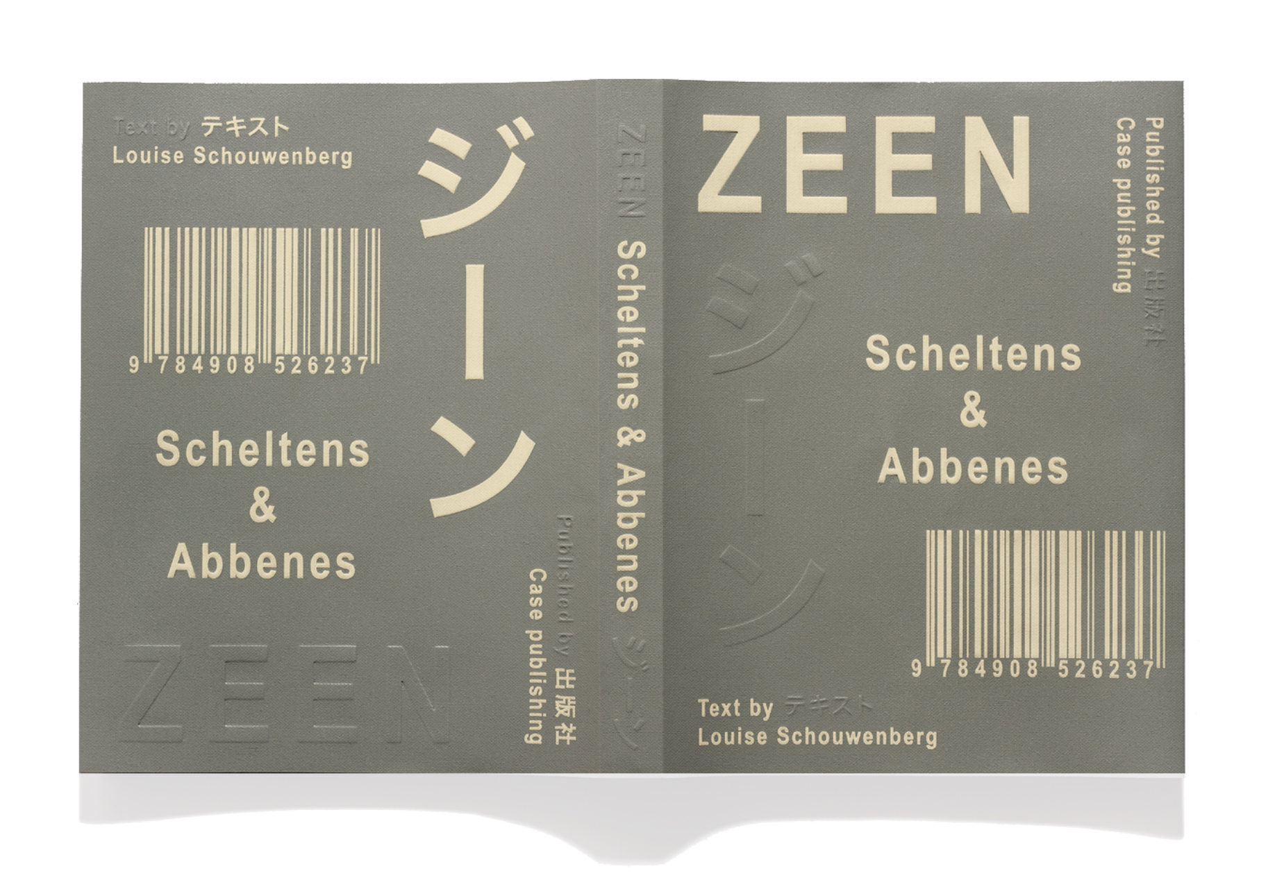
【CONCEPT OF ZEEN】 彼らの静物写真に現れる手で触れられるような感覚は、本のカバーに施されたエンボス加工と箔押しの文字に反映され、収録されている一連のイメージの流れは、読者が本の中を冒険するよう誘う。各ページに記されたコードから、彼らに作品を依頼したクライアントを参照することができ、インデックスでは読者がより多くの情報を検索できるようになっている。このような表やコードが持つ商業的な審美性は、工業製品の卸売カタログを想起させ、工業デザインからもヒントを得ていることがわかる。 また、Louise Schouwenberg(ルイーズ・ショウウェンバーグ)によるエッセイが3つのセクションに分けられている点にも特徴を見出せる。本文は英語と日本語の両言語に翻訳されているため、右綴じ・左綴じ、表紙・裏表紙の区別はなく、読者はどちらの方向からでも読み進められる構成、デザインとなっている。
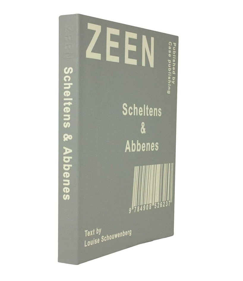
Case Publishing / 426ページ / ソフトカバー(エンボス加工・箔押し) / 225 x 170 mm / 9784908526237 / 2019年
$50 + shipping [we ship worldwide] only 4 copies available.
This book is the latest monograph by the Dutch artist duo Maurice Scheltens and Liesbeth Abbenes, published in conjunction with their exhibition of the same title held at Foam, the Photography Museum Amsterdam, in March 2019.
Throughout their career, Scheltens & Abbenes have created numerous works in the field of editorial design. Their work is characterized by a consistent aesthetic sensibility: even though individual pieces belong to different series, they hold the potential to merge with one another regardless of the year of production or context.
Focusing on this aspect, the book reproduces the publications in which each work originally appeared. It invites readers to explore how these images influence one another and interact, uncovering various contexts and prompting reflection on how they shape observation and interpretation. Some images appear twice in the book—when juxtaposed with others, they reveal new dimensions and meanings. Through these processes, Scheltens & Abbenes consistently direct attention to the hidden visual layers within their works, illuminating the relationships between each piece and its surrounding context.
While the book stands on its own as a complete photographic collection, it also encourages both exhibition visitors and readers to observe the world around them carefully—sometimes even at a microscopic level. The graphic design by Esther de Vries further supports this notion of conscious observation through multiple design strategies.
The title “Zeen” is derived from a Dutch anatomical term meaning “tendon” or “fiber”—“a strong yet flexible tissue that connects muscles to bones and gives them strength.” This meaning metaphorically expresses the way the camera “zooms in” to dissect matter in search of its essence. The term’s meaning, origin, and sound resonated deeply with the artists’ creative process. In addition to its anatomical origin, the word also draws inspiration from “Zen”, “Zein” (meaning “to see” in Dutch), and “Magazine.”
Concept of Zeen
The tactile quality characteristic of their still-life photography is reflected in the embossed cover and foil-stamped lettering of the book. The sequence of images inside invites readers to embark on a visual journey through its pages. Each page contains a code referencing the client who originally commissioned the work, while the index allows readers to access further information. These tables and codes possess a commercial aesthetic reminiscent of industrial wholesale catalogues, revealing the duo’s inspiration from product and industrial design.
The book also features an essay by Louise Schouwenberg, divided into three sections. The text is presented in both English and Japanese, with a binding design that eliminates the distinction between front and back, allowing the reader to begin from either direction.